
In the previous post I mentioned generally useful messages which can be annoying to visitors just due to way they were presented.
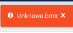
Here I have two more messages. The first is something special:
The second one is much more useful but the problem is the message cannot be closed despite it is very big:
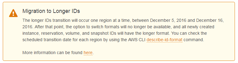
There’s just no way to say “OK, I got it, now let me see what I’ve come here for!”.
Don’t make your message unpolite, please. And remember to subscribe!
Related:
To switch or not to switch?
Switches and check-boxes on your page: make them better!
Switches and check-boxes on your page: make them better!
Just button
Some people don't like tests...or want to add some fun to your life.
Some people don't like tests...or want to add some fun to your life.
Splash screen on your website: KILL IT!
Long time ago, when internet was slow and browsers were stupid, we could see a lot of specially craf...
Long time ago, when internet was slow and browsers were stupid, we could see a lot of specially craf...