
Is your pop-up polite? Assuming we’re not speaking about spam, how comfortable are your messages and pop-ups for visitors?
1. If we respect our visitors we should give them ability to close pop-ups and other messages and don’t turn this activity to something like puzzle-solving.
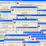
Here we have how NOT to do pop-ups:

(click to enlarge)
Please note where the close button is. You need some time to find it then to point on it. The location is counter-intuitive. The irony is the screenshot was taken at design-related page. If you think it looks better on the bigger screen then here you are:

(click to enlarge)
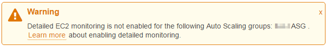
Sometimes it’s even worse: there’s no ‘close’ button at all – either as a cross symbol or as a text.
2. Avoid confusing icons and/or locations. At the first sight, which corner you’d direct your mouse to close the message?
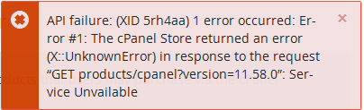
The ‘X’ on the left is quite bold and obvious but… this is nothing more than just symbol of an error. The real ‘close it’ ‘X’ is as always – at the top right corner, but it is much harder to see it.
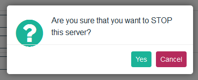
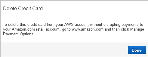
3. Paint dangerous button in red color. Not always applicable but definitely makes sense. If we’re to destroy something then it’d be wise to give one more warning – not with another message but with color. How NOT to do it:
Sometimes it’d be wise to add a checkbox as another level of safety and disable the ‘OK’ button until the checkbox is marked:
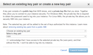
(click to enlarge)
4. Avoid annoying repeated messages. Well, you’ve warned the visitor about something (s)he potentially wouldn’t like to have (“Hey, there’s a cat on your monitor!”, do you remember those monitors?) but it would be quite annoying to see the message every time if you’re OK with that fact (“the cat protect monitor from collecting dust on it, shut up!”). Very simple: just add a checkbox ‘don’t warn me about it anymore’ or, better, something like drop-down ‘for 5 mins/1 hour/1 week/never/etc’. Of course don’t forget to add somewhere in profile/settings an option like ‘reset all warnings’. what’s irritating me personally:
5. Make it simpler! If a visitor did something wrong then give him/her the fastest way to make it correct.
Why, why on Earth they don’t just provided a visitor with the link to the proper page???
6. Well, it may looks obvious but… Test it!
7. Let me repeat: if a visitor did something wrong then make it easier to find the reason and fix the issue. Give him/her the fastest way to make it correct. This approach consists of two parts:
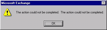
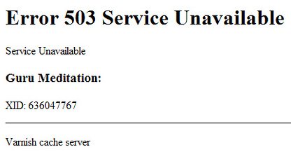
7.1. provide with the info what exactly went wrong or at least info where to find the details. If we have a website about kittens and mittens then ‘Something’s wrong’ or ‘internal error’ is probably better than ‘null-pointer exception at 0x1234567890 segment of LHC in CERN’ but definitely will not help to report error if needed. Two ways to make the messages better:
- link to all details, so the visitor can copy-n-paste them to a ticket
- if we do not want to discover our internals to visitors then log all details you may need on your side and show the ID of the record:
7.2. let them know how to fix (‘reload page’) or what to correct (‘the name cannot contain numbers’).
Of course, there are more ways to improve messages, but that’s all for today, stay tuned (subscribe) if you find the article helpful.
Have a good luck and may nice, neat and useful messages be with you!