

We have a plenty of switches around us, and of course on web pages too. Those in real life are usually more or less comfortable to use, but some web designers do their best to make you sorry you’re on that page.
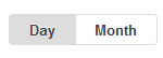 The first example. In which state the day/month switch is? There’s no obvious answer. It is unclear because such control element can originate from two types of model / prototype:

the sliding switch (image at the right) and the radio-button (in the old sense, when you could choose only one band on your radio).
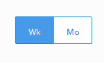 The second example of “don’t do it” from another website: week/month switch. It is even worse then the first one because readability is worse.
Well, it’s time for examples ‘how to do it better’.
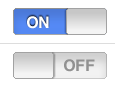
 With either of them you will see their state from the first sight. They are easy to read, and that with blue “on” have perfect readability ‘out of the box’.
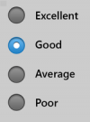
What if you need to have long labels instead of just ‘on/off’? Take a look at radiobuttons!
That’s all for today, and may power of great usability be with you!
 P.S.: do you know where the commonly used ‘power on/off’ symbol came from? It is exactly the toggle switch when you’re looking on it directly: the nut and the lever in the ‘up’ position.
The toggle switch image: thanks Wiki!
Related:
In the previous post I mentioned generally useful messages which can be annoying to visitors just du...
Not only customers provides feedback to you but you provide feedback to the customers too. Make it ...
Some people don't like tests...or want to add some fun to your life.