

Few posts ago I thought I saw the worst contact form. Now I know I was wrong.
The form I met since then requires a lot from you too, but this is only part of the problem:
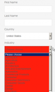
When you had a bad luck and didn’t fill a required field the form highlight it with a merry red color. Not the border around the field but the whole item. Wait, I’ve not finished yet. If your luck was bad enough and you missed to chose something from drop-down list then you suddenly see a BIG RED BOOOOM:
(clickable, of course)
I’ve spared your senses and shrank & cropped the screenshot, but indeed it looked like the website barks at me! Okay, I do apologize that I haven’t filled in that form properly and I am really sorry …. that I’m on your website.
Also please note such aggressive background hinder you from see the text, the color palette here is definitely not the best one.
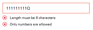
How it should be done: just a red mark near the required missed field. Better if you add more details especially if the item requires certain format of the data. Just a polite example:
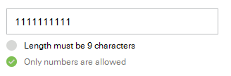
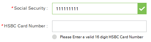
 Even better if the mark turns to green when the content of the mandatory field is OK. I spent some time trying to find the form having nothing to cavil at and eventually found it deep at hsbc.com:
When the field is partially correct:
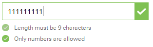
and when the field is correct the form temporary turns both indicators green and add the green mark at the right side:
then hide the marks below the field and shows just the field highlighted with green:
That’s all for today, feed your website well (and don’t forget about the web designer/UI staff too, or whoever does this job for you) and may the visitors be glad to contact you!
Share the article if you like it, comment if you don’t like and offer new topics in any way!
(Thanks Dineshraj Goomany for the dog)
Related:
Make sure you don't scary your future client.
Not only customers provides feedback to you but you provide feedback to the customers too. Make it ...
Possibility to reload a time-sensitive chart or a table without reloading the whole page is importan...