

Hi All, today we have a website which belongs to a kind of L’homme orchestre: a person who says that he can do everything for your website: WP Developer, Designer, SMM & SEO guy etc etc.
Ok, let’s see what we have here. I will not go deep in optimization, broken links etc – other reviewers will say about those errors, I’m going to focus on something that is not too tech… or something barking. All screenshots are clickable.
 1. The main menu is broken. No comments, you have to check the site as thoroughly as you can including different browsers and screens. Socializer looks exactly like menu item which looks strange and misleading.
2. This site is CPU-hungry. I can hear cooler of my PC becomes furious when this tab is open. 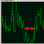 I do test websites on five years old laptop because if you design websites for modern desktops / phones only then you admit you cannot do it well or you’re too lazy. On the CPU chart the red arrow shows time when the tab was closed, no changes in other activity. I started to look what may force regular WP page be so ineffective (let’s stress a bit: anti-eco-friendly) and eventually found: video in background. Well, I admit sometimes it can be useful. For example here video is a part of content, illustration to what you can do there. At Rembrandt’s site it is – ta-dammm(n)! –
  not just background but background which is almost invisible to user because of a lot of content and, moreover, is not sharp. All you see there is moving silhouettes. Also, do you see broken button at the bottom right? And copyright up to 2099(!) as symbol of laziness? Hint: if you don’t want to switch copyright year every January then use one line of code in your favorite programming language which will switch year for you.
3. Not moving too far from this video part: it’d be fine to click on logos in ‘trusted by’ and see how really you are trusted.
4. Scroll up a bit, he says you should see his Exclusive Report. Maybe it’s a good idea, but there’s no way to return from rembrandtmadera.ga/hashtag-form to the main page: there’s no either home page link or menu. Also, I’d like to see some details about report to make sure I need it before submit the form.
5. ‘Designs’ page. Portfolio. Holy of Holies of any designer.  And the first work you see is partially covered with black triangle.
 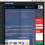 I say nothing about text over face or drop cap letters instead of bullet points and funny effect as the result, but if you think the ‘open’ link will show you good view… Well, I was disappointed (screenshot at right). Rembrandt, don’t you know how to zoom images according to width?
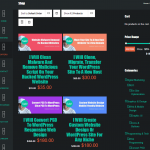 6. Sorry but round ‘sale’ marks on author’s face resembles shiner. A lot of bold text draws visitor’s focus away, doesn’t allow to stop at one place. Menu elements are not readable due to enormous amount of in fact useless text. Let’s compare, what is easier to read and understand: ‘I Will Implement Onpage Seo To Your Site Meta Tags, Alt Tags, H1, H2, H3 Titles’ or ‘Page optimization’? What’s more clear: ‘I Will Clean Malware And Remove Malicious Script On Your Hacked WordPress Website’ or ‘Malware cleanup’? And eventually, why so much text instead of a pictogram which is easier to interpret and understand, and requires less time to make decision? Hint: not ‘Seo’ but ‘SEO’
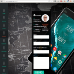 7. Contact page. Why it’s impossible to copy a phone number, is it a kind of protection saying ‘don’t call me’? Looks like context menu on this page does not work at all too. So, you cannot copy-n-paste your phone/email/message. Also, No captcha intentionally?
8. Submit button at the very bottom (on the same page) is not a problem by itself. The problem is: when you submit the form you don’t see spinner and ‘thank you’ message below the button. Even worse: you don’t see if something goes wrong: the error message will be below the button too. Instead, the button should disappear and the resulting message displayed. Alternatively you can make the form wider, then it will be not so tall. After all, isn’t the contact form more important than background of that page?
9. A bit more about background: if it is not as important as content then it makes sense to dull it. Yep, I’m about the same form.
10. Why email has not the same domain name as the website? I can forgive it for any non-IT business but if web-guy cannot configure mail on its own domain…
That’s all for today. I believe I listed here the biggest errors however there are more of them.
Feel free to contact me if you need a website rewiew