

Clicks, unlike a page content, are visitors’ contribution. So don’t build obstacles but make clicking as easy as possible.
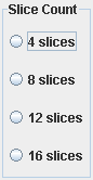
Bad: clickable is radiobutton only, the circle.
Better: the text label is clickable too.
Best: the whole block with the radiobutton and the text is clickable.
Below is a list of two courses, it is assumed a visitor should select one to continue:

For some reason clickable is the text only.
Better: the image is clickable as well. It is much faster and easier to click there than on the text.
Best: rectangle with the image and the text is highlighted onMouseOver and clickable.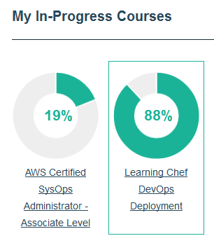
The same we can say about check-boxes, icons, buttons. ![]() Don’t force your visitor to be a sniper, make it easy to click!
Don’t force your visitor to be a sniper, make it easy to click!
Related:
Bad messages 2
In the previous post I mentioned generally useful messages which can be annoying to visitors just du...
In the previous post I mentioned generally useful messages which can be annoying to visitors just du...
The best auto-reload button
Possibility to reload a time-sensitive chart or a table without reloading the whole page is importan...
Possibility to reload a time-sensitive chart or a table without reloading the whole page is importan...
Splash screen on your website: KILL IT!
Long time ago, when internet was slow and browsers were stupid, we could see a lot of specially craf...
Long time ago, when internet was slow and browsers were stupid, we could see a lot of specially craf...