Category User Interface

Splash screen on your website: KILL IT!
Long time ago, when internet was slow and browsers were stupid, we could see a lot of specially crafted pages which welcome you when you hit the website for the first time. At that stone age the splash screens were necessity: there was no other way to ask visitor which language s/he prefers or whether […]
Just button
Some people don’t like tests…or want to add some fun to your life.
The best auto-reload button
Possibility to reload a time-sensitive chart or a table without reloading the whole page is important. Here’s the most efficient way I’ve ever met.

Don’t let your website bark at visitors
If a visitor haven’t filled in your form properly then don’t punish but help with handy form validation

Feedback is super important!
Not only customers provides feedback to you but you provide feedback to the customers too. Make it positive!

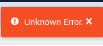
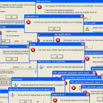
Bad messages 2
In the previous post I mentioned generally useful messages which can be annoying to visitors just due to way they were presented. Here I have two more messages. The first is something special: The second one is much more useful but the problem is the message cannot be closed despite it is very big: There’s […]

Need more clicks? Make it easy to click!
Buttons and other clickable elements on your website: make them more efficient!

Recent Comments